手撕面包
十六、解析URL
十五、Promise相关
promise相关概念
首先需要知道回调函数:将一个方法fun2作为参数传入方法fun1,当fun1满足某种条件时才执行传入的fun2;
这也是Promise的核心思想:我现在告诉你,等我准备好了你要做什么。类比于我点外卖告诉平台'送到后给我打电话(回调函数)',而不是一直站在家门口等。
Promise本身不是异步的,它的创建和执行是同步的,但它管理的内容是异步的:
new Promise()操作本身同步- 执行器
(resolve,reject)=> {...}同步执行 resolve() 和 reject()通常在异步操作完成后调用
Promise这种.then()链式调用的方式解决的了回调函数的回调地狱,让异步代码阅读起来像同步一样清晰。异步操作的应用场景有网络请求、文件读写、用户交互等。
promise的基本用法
// 1.创建Promise实例
const promise = new Promise((resolve,reject)=>{
  // 这里是执行器函数 会同步执行
  console.log('Promise被创建了')

  // 模拟异步操作
  setTimeout(()=>{
    const success = Math.random() > 0.5

    if(success){
      resolve('操作成功')//此时将状态改为fullfilled
    }else{
      reject('操作失败')//此时将状态改为rejected
    }
  },1000)
})

// 2.使用.then()处理结果
promise.then(
  // 第一个参数处理成功状态
  (result)=>{
    console.log('成功',result)
  },
  // 第二个参数处理失败状态
  (error)=>{
    console.log('失败',error)
  }
)
// 更常见的作法 用catch和处理专门的错误,抛出异常并不会卡死js而是会进入catch函数中
promise
  .then((result)=>{})
  .catch((error)=>{})
有趣的联想
为什么叫Promise承诺?Promise的初始状态一定是pending, 状态的变化只能从 pending => fullfilled或者pending => rejected,状态更改后不可逆,即状态一旦确定就不可更改。
这也是为什么Promise被称为承诺,因为一旦给出结果就不会改变,开发者可以完全信赖这个结果!
拓展:【关于Promise不可逆的设计哲学】一个操作结果应该是明确的(确定性)、开发者可以信赖它的结果(可靠性)、避免了复杂的状态管理(简单性)、防止竞态条件和内存泄漏(安全性)
Promise.all
并行执行多个异步操作。接收一个Promise数组,当所有Promise都成功,返回一个包含所有成功结果的数组;若有一个失败,则立刻返回失败的原因。
但这并不意味着失败优于成功,而是Promise.all执行的是快速失败机制,一旦检测到任何一个失败,立刻终止,直接返回失败。如现实中电商订单的处理,支付验证、地址验证、库存检查,一旦一个环节出现问题,都会出现支付失败。
若需要全部完成后再处理,使用Promise.allSettled(),他会等待所有的Promise完成,不管成功还是失败。
之前在网上看到的Promise.all遵循【谁跑得慢 以谁为准执行回调】,我想在此说明一下,这句话的场景适用于Promise.all全部成功的情况下,会等待最慢的那个完成,再返回所有成功的结果。
Promise.race
竞速逻辑,只关心第一个取得结果的Promise,无论成功或者失败都是结果。
但注意 其他Promise是继续执行的,只是结果被忽略。
适用场景:超时控制、竞速访问、用户操作超时等。这样的设计路让Promise.race非常适合需要设置时间限制或选择最快响应的场景。
console.log('开始race测试');

const p1 = new Promise(resolve => {
    setTimeout(() => {
        console.log('p1 完成'); // 这行仍然会输出!
        resolve('p1结果');
    }, 2000);
});

const p2 = new Promise(resolve => {
    setTimeout(() => {
        console.log('p2 完成'); // 这行仍然会输出!
        resolve('p2结果');
    }, 1000);
});

Promise.race([p1, p2])
    .then(result => {
        console.log('race结果:', result); // 'p2结果' (1秒后)
    });

/* 输出:
开始race测试
(1秒后) race结果: p2结果
(1秒后) p2 完成
(2秒后) p1 完成  ← p1虽然"输了",但仍然执行完成
*/
Promise.any
只关心第一个成功的结果,忽略失败;但如果全部失败,返回一个AggregateError,包含所有的结果失败的原因。
场景应用:多来源数据获取用第一个可用的;服务降级、优先使用高性能服务;快速尝试多种方法取第一个成功的。
Promise.prototype.finally
在JavaScript中,所有实例都可以访问原型链上的方法promise.finally即Promise.prototype.finally
// 创建一个Promise实例
const promise = new Promise((resolve) => resolve());

// 实例可以访问Promise.prototype上的方法
promise.then(() => {});
promise.catch(() => {});
promise.finally(() => {});
这也是JavaScript的查找机制,更是JS面向对象编程的基础:
 当调用 promise.finally() 时,JavaScript这样做:
 1.检查 promise 对象本身是否有 finally 方法 → 没有
 2.检查 promise.__proto__ (即 Promise.prototype) 是否有 finally 方法 → 有!
 3.调用 Promise.prototype.finally

 可视化查找过程:
 promise → [[Prototype]] → Promise.prototype → [[Prototype]] → Object.prototype → null
十四、bind、apply、call的用法
相同点和不同点
相同点:
- 都用于改变this指向
- 接收的第一个参数都是this要指定的对象
- 都可以利用后续参数传参
不同点:
- call和bind是依次传参,apply是第二个参数数组传参
- call和apply是直接调用(apply应用于手写new),bind不会立即调用,而是返回一个修改this后的函数
- 关于bind的参数说明:
function original(a, b, c, d) {
      console.log('所有参数:', a, b, c, d);
  }
  // 使用 bind 预设前2个参数
  const boundFunction = original.bind(null, 1, 2);
  original(3,4) //3,4,undefined,undefined, bind返回的函数不包括预设参数在其形参列表中

  boundFunction(5,6) // 1,2,5,6
  /* 1,2,5,6,但调用时包含了预设参数和剩余参数
     预设参数:在bind时确定
     剩余参数:在调用时候确定
     自定包含:调用boundFunction(5,6)时,实际执行original(1,2,5,6)
  */
手写实现
-----占位
十三、手写new
new干了什么
new不是简单的复制,而是创建一个新对象并建立原型链关系。具体步骤 :
- 创建一个新(空)对象
- 设置原型链,将新对象的
_proto_属性指向构造函数的prototype - 将构造函数中的this绑定到这个对象
- 执行构造函数,为了初始化属性
- 返回对象,若构造函数没有返回对象,则返回新的对象
自我思考部分:
- 第2步实现的目的:是为了将新创建的对象与原型链关联,从而使用原型链上的属性和方法
- 第3步实现的目的:将构造函数中的this与新对象绑定,是为了在构造函数中更方便对新对象进行设置。或者说,可以在构造函数中通过this设置的属性和方法就会添加到这个新对象上,不需要去return了:
// 没有 this 绑定,我们只能这样做: function createPerson(name) { const obj = {}; obj.name = name; obj.age = 0; return obj;// 需要手动创建对象并返回 } // 有 this 绑定,new 帮我们自动完成: function Person(name) { this.name = name; // 直接操作"未来的实例" this.age = 0; // 不需要 return,new 会自动返回 } - 第4步的疑问:执行构造函数和初始化的意义?为什么执行就可以初始化?因为构造函数中通常会写一些初始化的逻辑,比如设置初始状态、分配资源、建立关系等。初始化的意义在于,对新new出来的实例对象是公平的,每个新对象都是初始状态,而不是半成品。
func.apply(thisArg, [argsArray]) // 在js中,apply定义为同时具备调用函数和绑定this的功能,所以手写这一步也包含执行构造函数并初始化的意思 // 关于this的指向,是将func当中的this指向指定的thisArg。注意在非严格模式下,this会指向全局对象 - 第5步的疑问:构造函数返回值的处理逻辑?为什么要区分返回对象的情况?如果不做这个判断,那么会总是返回新创建的对象,忽略了构造函数的返回值。
- 关于原型链的复习
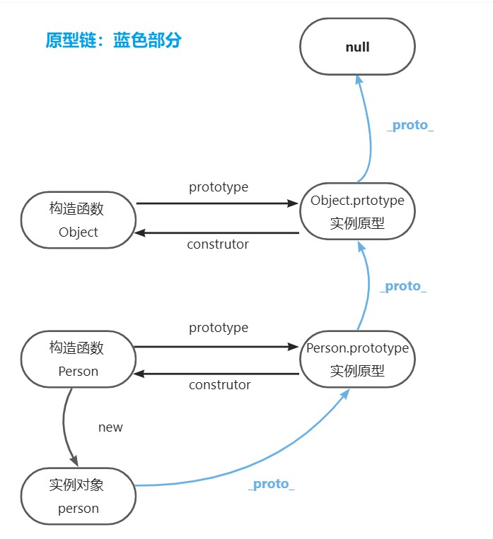
手写new
function myNew(constructor,...args){
  const obj = Object.create(constructor.prototype)
  const result = constructor.apply(obj,args)
  return result instanceof Object?result:obj
}
十二、柯里化函数
溯源历史
这个思想可以追溯到19世纪数学家Gottlob Frege,但组合逻辑创始人 Haskell Curry对其进行系统化研究和发展,所以用了他的名字 Curry 命名。
函数柯里化从数学引入计算机领域,主要原因是函数式编程范式的兴起、λ演算的理论基础、提供了更灵活的函数组合方式:
过程式语言如C,因为设计哲学的原因,函数在这里不是“一等公民”,所以不支持柯里化。
概念与应用
概念:一种将多参数函数转化为一系列单参数函数的技术。每个函数接受一个参数并返回接受下一个参数的函数,直到所有参数都收集完毕才执行函数。
应用:参数复用(事件处理、配置函数等场景)、延迟执行、函数组合。link,搜'应用场景(前端特定)'
经典面试题
实现技术点:
- 基于闭包:利用JS的闭包特性保存中间状态
- 延迟执行:参数未收集完成时不执行实际计算
- 函数组合友好:便于创建可复用的函数片段
经典面试题 题解:
function curryFn(fn) {
  if(typeof fn !== 'function'){
    throw new TypeError('curry requires a function')
  }
  return function curried(...args){
    // 如果传入的参数数量大于等于 原函数 需要的参数数量,直接调用原函数
    if(args.length >= fn.length){
      return fn.apply(this,args)
    }
    // 否则返回一个新函数,继续接收剩余参数
    return function (...nextArgs) {
      return curried.apply(this,args.concat(nextArgs))
    }
  }
}
十一、实现九宫格布局
考察CSS的布局和运用的理解能力,包括Flexbox、Grid、float、table.应用场景:电商产品图展示,功能入口网络、游戏界面、数据展示等。衍生问题:
- Flexbox vs Grid 各自的优缺点?
- 如何选择适合的布局方案?
- 不同方案的浏览器兼容性如何?
Flex box适合一维布局(单行或单列),Grid适合二维布局;实际开发中可能会结合使用,移动端采用flex,大屏设备使用grid.这样既能保证浏览器的兼容性,又能保证现代浏览器的强大功能。
Flexbox
.container{
  display:flex;
  flex-wrap:wrap;
  width:300px;
  height:300px;
}
.item{
  width: 33.33%;
  height: 33.33%;
  box-sizing: border-box;
  border: 1px solid #ccc;
}
Grid 布局(现代推荐)
.container{
  display: grid;
  /* repeat是重复函数,表示重复3次,fr 单位表示网格容器中可用空间的一部分。
  1fr表示意味着网格容器被分为3列,每列宽度相等,各占可用空间的1/3。 */
  grid-template-columns: repeat(3,1fr);
  grid-template-rows: repeat(3,1fr);
  width: 300px;
  height: 300px;
  gap: 1px;
  background: #ccc;
}
.item{
  background: purple
}
float(传统方案)
.container{
  width: 300px;
  height: 300px;
  background: #ccc;
  overflow: hidden;
}
.item{
  background: purple;
  float: left;
  width: 33.33%;
  height: 33.33%;
  /* 浮动布局中元素要加上box-sizing:border-box的写法 因为是为了解决盒模型计算的问题
  浮动布局依赖精确的宽度计算,百分比宽度配合 border-box 可以确保布局准确。 */
  box-sizing: border-box;
  border: 1px solid #ccc;
}
table布局不做解释,它的语义不符合主流写法。
十、用css实现三角
标准答案有八种三角形实现,但我觉得只需要知道核心原理、实现能力(写出1-2种三角形)、扩展思维(举一反三推出其他三角形实现)就可以了。
css实现
<div class="triangle"></div>
<style>
  .triangle{
    width:0;
    height:0;
    /* 向上的三角形,代码里就写下,反过来的,朝向左右也同理 */
    border-bottom:50px solid #333;
    border-left: 50px solid transparent;
    border-right: 50px solid transparent;

    /* 向下的三角形 */
    border-top:50px solid #333;
    border-left: 50px solid transparent;
    border-right: 50px solid transparent;
  }
</style>
clip-path方法
clip-path是CSS3的属性,用于裁剪元素的显示区域,polygon()用于定义多边形的坐标;坐标点可以按顺时针或逆时针顺序排列,但必须连续且有序;
%是相对于元素自身的宽高,当然也可以用px表示。
.triangle{
  width:100px;
  height:100px;
  background:#333;
  clip-path:polygon(100% 0,50% 100%,0 0)
}
canvas实现
<canvas id="myCanvas" width="100" height="100"></canvas>

<script>
const canvas = document.getElementById('myCanvas');
const ctx = canvas.getContext('2d');

// 方法1:路径绘制
ctx.beginPath();
ctx.moveTo(50, 0);    // 起点:顶部中点
ctx.lineTo(0, 100);   // 左下角
ctx.lineTo(100, 100); // 右下角
ctx.closePath();      // 自动回到起点
ctx.fillStyle = '#333';
ctx.fill();

// 方法2:更简洁的写法
ctx.beginPath();
ctx.moveTo(50, 0);
ctx.lineTo(0, 100);
ctx.lineTo(100, 100);
ctx.fill(); // 自动闭合路径并填充
</script>
九、文字溢出
文字溢出与文本溢出
- 文字溢出 重点是单个字符的视觉表现和排版
先展示单行方案,强调这是最基础最重要的; 再展示多行方案,说明WebKit限制和替代方案; 重点体现对CSS基础属性的熟练掌握;
- 文本溢出 重点是段落内容的布局和结构处理
重点展示兼容性更好的定位方案; 详细说明伪元素的实现原理; 讨论背景色匹配、行高计算等细节问题; 体现解决实际问题的能力;
单行文字实现
.text{
  text-overflow: ellipsis;/*ellipsis 省略*/
  overflow: hidden ;
  white-space: nowrap;/*nowrap 换行*/
}
多行文字实现
即第八、旧版弹盒法
八、文本溢出
前端开发中使用场景:内容列表展示、卡片布局。有两种方式,如果对兼容性要求高,需要支持所有现代浏览器,使用定位伪元素遮盖;若用户使用的是Chrome或Safari,使用旧版弹盒法。
定位伪元素遮盖
.father{/*父元素*/
  postion:relative;/*子绝父相 给伪元素定位*/
  overflow:hidden;
  text-align:justify;
  line-height:20px;
}
.father::after{
  position:absolute;
  right:0;
  bottom:0;
  content:'...';/*插入省略文本*/
  width:1em;/*为了遮盖时正好遮住原来一个字的大小*/
  background-color:'';/*设置和父元素背景相同的颜色*/
}
伪元素vs伪类
伪元素:创建不在文档树中的虚拟元素,::
伪类:选择已有元素的状态,:
旧版弹性盒法
.box{
  display: -webkit-box;
  /* 弹性盒子元素垂直排列 */
  -webkit-box-orient: vertical;
  /* 控制要显示的行数 */
  -webkit-line-clamp: 3;
  overflow: hidden;
}
七、三栏布局
解释
将页面水平分为三份,表现形式:左右固定中间自适应(常见,经典圣杯布局、双飞翼布局)、左右自适应中间固定、三个都自适应(比例一般1:2:1)、一个固定两个自适应(少见)
实现方式
绝对定位不推荐,脱离文档流
relative:不脱离文档流,不影响其他元素布局。absolute:脱离文档流,根据父元素或根元素定位。
<div class="container">
  <div class="main">中间自适应</div>
  <div class="left">左侧固定</div>
  <div class="right">右侧固定</div>
</div>
<style>
 .contain{
    padding: 0 200px;
    overflow: hidden;
  }
  .main,.left,.right{
    float: left;
    position: relative;
    min-height: 300px;
  }
  .main{
    background-color: pink;
    width: 100%;
  }
  .left{
    background-color: plum;
    margin-left: -100%;/* 移动到上一行的最左侧 */
    right: 200px;/* 相对定位调整到正确位置 */
    width: 200px;
  }
  .right{
    background-color: aquamarine;
    width: 200px;
    /* 为什么不用margin-right?
    因为所有栏都设置了float:left 元素从左到右排列 一定要用margin-left 移动到上一行的最右侧*/
    margin-left: -200px;
    left: 200px;/* 相对定位调整到正确位置 */
  }
</style>
<div class="double-wing">
  <div class="main-wrapper">
    <div class="main">中间内容(自适应)</div>
  </div>
  <div class="left">左侧边栏(固定200px)</div>
  <div class="right">右侧边栏(固定200px)</div>
</div>
<style>
.double-wing {
  overflow: hidden;
  min-height: 300px;
}
.main-wrapper, .left, .right {
  float: left;
  min-height: 300px;
}
.main-wrapper {
  width: 100%;
  background: pink;
}
.main {
  margin: 0 200px;/* 主要内容区域的内边距 */
  height: 100%;
  background: plum;
}
.left {
  width: 200px;
  margin-left: -100%;/* 移动到第一行最左边 */
  background: beige;
}
.right {
  width: 200px;
  margin-left: -200px;/* 移动到第一行最右边 */
  background: beige;
}
</style>
<div class="flex-container">
  <div class="left">左侧边栏(固定200px)</div>
  <div class="main">中间内容(自适应)</div>
  <div class="right">右侧边栏(固定200px)</div>
</div>
<style>
.flex-container{
  display: flex;
  min-height: 300px;
}
.left{
  width: 200px;
  order: 1;/*控制显示顺序*/
  background: plum;
}
.main{
  flex: 1;/*占据剩余所有空间*/
  order: 2;
  background: pink;
}
.right{
  width: 200px;
  order: 3;
  background: plum;
}
</style>
<div class="grid-container">
  <div class="left">左侧边栏(固定200px)</div>
  <div class="main">中间内容(自适应)</div>
  <div class="right">右侧边栏(固定200px)</div>
</div>
<style>
.grid-container{
  display: grid;
  grid-template-columns: 200px 1fr 200px; /* 左右固定,中间自适应 */
  min-height: 300px;
  gap: 0; /* 可选:去掉间距 */
}
.left{
  background: plum;
}
.main{
  background: pink;
}
.right{
  background: plum;
}
</style>
圣杯和双飞翼的名字由来
- 圣杯:西方文化中象征着"神圣的追求目标"(耶稣晚餐用过的杯子 比作美好),这个布局在当时(2006年左右)被认为是CSS布局的"圣杯"——一个难以实现但非常理想的三栏布局目标。
- 双飞翼:由淘宝UED团队提出,名字来源于"双翼",比喻中间内容区域像鸟的身体,左右两侧像翅膀一样展开。
- 两者都是三栏布局,且最后呈现的视觉效果相同,但代码实现思路不同;
- 双飞翼是圣杯的优化版本,解决了浏览器兼容问题;圣杯的html结构更简洁,双飞翼多一层包裹。
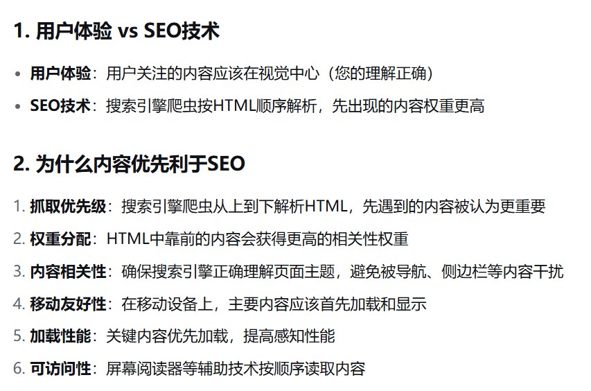
- 注意:圣杯布局和双飞翼布局的中间栏div都是在html结构中先写的,这样写浏览器会优先解析展示中间内容,利于SEO.
六、两栏布局
解释
两栏布局是一种布局现象,并不是css种规定的专业名词,但行业通用。
最常见的是左侧固定、右侧自适应;除此之外,还有右侧固定、左侧自适应;两侧都自适应
<div class="container">
  <div class="left">左边浮动元素</div>
  <div class="right">右边普通元素</div>
</div>
实现方式
掌握浮动和Flex就足够应对大多数情况。
Grid布局比较新颖(语义化);绝对定位:不推荐,影响文档流;表格布局:display: table 已过时
/* 1.父元素加BFC,固定部分浮动并给出宽高,自适应部分使用margin-方向来固定 */
.container {
  border: 3px solid red; /* 用红色边框标识父容器范围 */
  overflow: hidden;
}

.left {
  float: left;
  width: 200px;
  background-color: gray;
  height: 400px;
}

.right {
  /* 注意:这里没有 margin-left */
  margin-left: 200px;
  background-color: lightgray;
  height: 200px;
}
/* 2.父元素flex,固定部分给出宽度,自适应部分用flex:1的属性拉满剩余空间 */
.container {
  border: 3px solid red; /* 用红色边框标识父容器范围 */
  display: flex;
}
.left {
  width: 200px;
  background-color: gray;
  height: 400px;
}
.right {
  flex: 1;/* 自适应部分占据剩余空间 */
  background-color: lightgray;
  height: 200px;
}
/* 3.Grid布局 新颖且语义化; */
.container {
  border: 3px solid red; /* 用红色边框标识父容器范围 */
  display: grid;
  grid-template-columns: 250px 1fr;/*第一列宽度250px 第二列宽度剩余空间的一部分*/
  grid-template-areas: "sidebar main";/*定义子元素语义化属性*/
}
.left {
  grid-area: sidebar;
  background: #f0f0f0;
  background-color: gray;
  height: 400px;
}

.right {
  grid-area: main;
  background-color: lightgray;
  height: 200px;
}